|
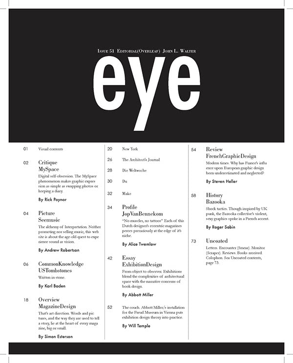 I liked the clean, sleek look which is the preferred style for my magazine. My cover page is relatively simplistic, so I would like my table of content to be as well. I would use a different color scheme than white and black to match my cover page and the rest of my magazine. I would most likely create a table of content similar to this in which I replace the word "eye" with "stress," fitting my concept of AP student burnout. 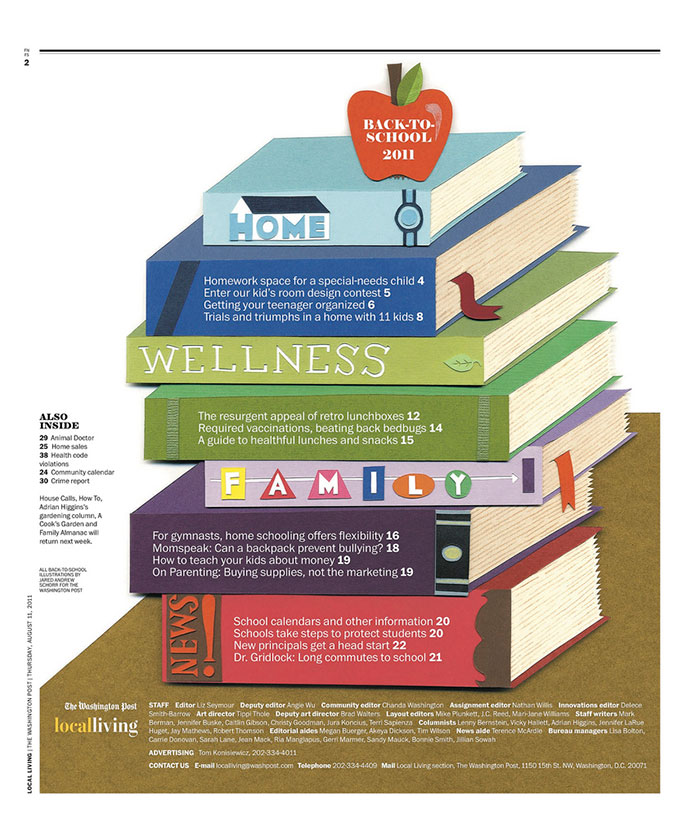 I liked the color scheme and the unique layout of using stacked books to present your content. I wouldn't personally use this style for my table of content, but I'm using it as inspiration for my color scheme and additional unique touches for my work. This fits my concept because it shows a pile of books on top of each other, similar to the workload given in higher level classes. 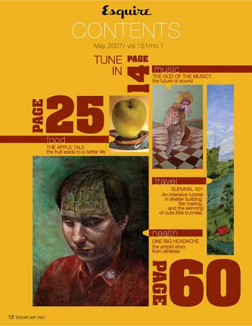 I liked the spatial organization and the strong, rich colors used to provide a sharp contrast, similar to my cover page. This helped me understand how I could potentially do my spatial layout for my table of content. However, I strongly disliked the enlarged font for the page numbers and how thin the images appeared. I would personally use wider and larger images. Potential Article Topics:
Source Credit:
0 Comments
Magazine Write-Up Masthead - The title "Aftermath" has a negative connotation which suggests an event has occurred resulting in a negative consequence. Aftermath literally means the consequences or aftereffects of a significant unpleasant event. This was the specific tone I was looking for in my magazine. Typography - The dark blues suggest a depressive tone and the yellows are used for the purpose of being seen by the readers because with a lighter background the words would be more difficult to read. The title is the second focal point after the image in the center which shows the purpose of my magazine. I wasn't thinking with a specific focus on the placement of my words and images in relation to the tone and mood of the magazine cover. I wanted a clean, geometric cover for a clear and neat look. My arrangement and size doesn't add to my purpose. Image - The image will most likely either be myself or one of my friends as the stressed out student surrounded by homework and books. The sheer look of panic and pain will be displayed on their face as well as the frazzled hair, and there could be the potential of a crying student on the front cover. The shot will either be wide or medium. The focal point will be the face, so a lot of light will be shone on it. My audience is catered to kids my age and especially those who are taking AP and understand how large of a mental toll school has taken out on them. Language - The strapline is AP student burnout which is the theme of my magazine. This suggest my magazine will discuss the struggles faced by AP students and how it has led to a mental and physical burnout. The readers will obviously be AP students and potentially AP teachers who want to understand the problems faced by AP students. The cover line tells you exactly what the article will discuss, there is no rhetoric. The most notable linguistic features are the capitalized and emboldened titles and colored fonts to attract more readers. 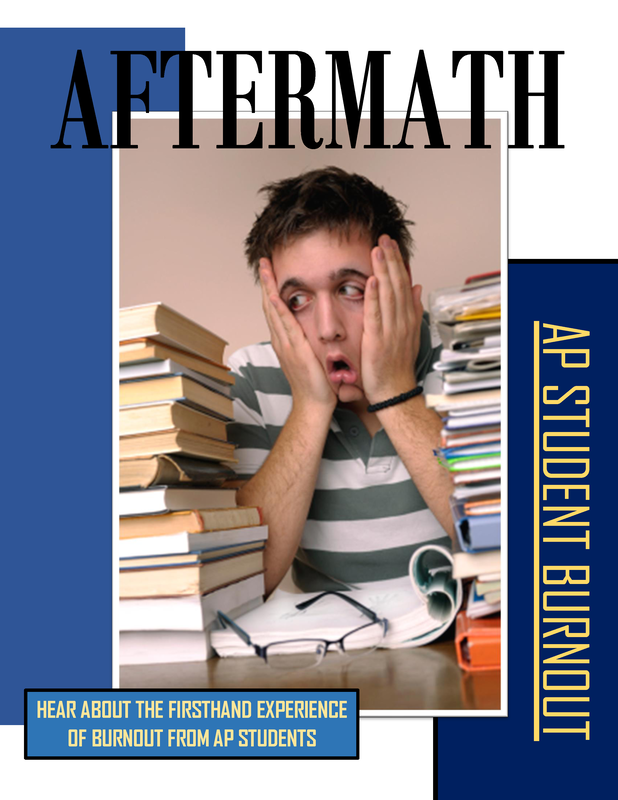 Notes Camerawork: 2 people shot; head shot for dialogue between the two people, the damage done to the wife, and the distress on his face; wide shot to capture scenery; medium shot; shot reverse shot Sound: Suspenseful music – incidental music; shotgun shot; broken washing machine; wrenching turning – fixing the washing machine Mise-en-scene:
Editing: Continuity system – conducive for a narrative Comparison For similarities, we've both mentioned the different camera shots used and the shot reverse shot to capture the wife's and the husband's conversation. However, I didn't discuss whether the camera angles were high, low, or eye level. I've also mentioned the different aspects of the mise-en-scene which included the dim lighting, the highlights/shadows, and the dull clothing of the characters which the student sample also discussed. However, I provided a more in-depth analysis of the characters such as their attire and their reactions in my notes. The student sample described in technical terms and more in-depth about the editing style and the different sound techniques used compared to my notes. I only described the sound as suspenseful and the different sound effects used without mentioning the technical terms such as diegetic or non-diegetic sound. The student sample also described the pace and tempo of the video using sound while I've never even thought of that. I'll most likely include this in my next practice. Response
In the opening scene, the woman enters the living room hearing the ruckus caused by her husband, Lester trying to fix the washing machine in the basement. She’s dressed in a gray cardigan, checkered button-down shirt, and black slacks. Her hair is pinned back and gold dangly earrings to accessorize. As she walks down to the basement, the lighting is very dim and shadowy. This style of lighting was used throughout the scene to create a suspenseful and dark mood. The lighting mainly comes from the lamps or the lights hung on the wall which had a warm yellow tint on the set. The lighting also casted a shadow on the actors’ faces which helped accentuate their wrinkles and hide certain facial features such as the eyes. The color theme consisted of mainly neutral to warm tones of brown, gray, and red. Once Lester’s wife entered the basement, they began arguing over the broken washing machine caused by Lester. They were frustrated with each other. It was evident that their marriage was failing apart, and their relationship was tumultuous. The camera work consisted of wide shots, medium shots, and close-ups when they were having a conversation which showed their displeasured facial expressions. The wide shots were used to capture both people in the scene and the shoddy, broken basement background. Eventually, Lester proceeded to get the hammer laying on top of the toolbox and smashed it into his wife’s head. He began violently assaulting her and blood splattered onto his white button-down and black slacks while background music was playing to fit the mood. The camera panned to a close up of Lester’s panicked face and the poster of the swimming fishes. The poster of the fishes swimming may be symbolism for the wife’s death. He started to undress into his boxers and wife beater shirt which could be another form of symbolism. He removed his blood-stained clothes and wiped the blood off the hammer. After this, it cuts to the next scene where he’s on the phone trying to reach a person that could help him hide his wife’s dead body. The person agreed and Lester went to get his shotgun. They added incidental music and a shotgun loading sound effect as he was loading his gun. The editing style follows a continuity system which is conducive for a narrative. The video ends open-ended as Lester hid the shotgun away in the bathroom and hear a knock on the door. Comparison My analysis was much shorter and less descriptive in comparison to the student sample which suggests I should write and describe in more detail about the video such as the editing and sound techniques, the mood/tone, the relationship between the characters, and the components that make up the mise-en-scene. The student sample included a strong introduction which gives a general overview such as the tone and setting of the video. The student sample also mentions how the different camera angles allow the audience to engage with the scene. However, my primary focus gave more description on the symbolism throughout the video and the interactions between the characters. I definitely needed to focus more on the technical aspects of the mise-en-scene instead of just the characters. The student sample writing followed a chronological order which helps with the organization of the analysis while mine was a little bit more all over the place. The student sample did an excellent job on how the camera shots, the lighting, the character's inner feelings/thoughts and the sound effects affected the audience's interpretation of the video and prepared the mood for the upcoming scenes. We've both described the dim lighting and the shadows created on the actors' faces, the mood of the video, and the different camera shots used to capture the actors and the setting. |
